Windforce - Website re-design
Digital Transformation for Global Renewable Energy
WindForce PLC is a market-dominant developer and operator of wind, solar, and hydro power plants, managing the full EPC process and operating internationally (Sri Lanka, Pakistan, Uganda, Ukraine). Their operations commit to UN SDG 7 (Affordable Clean Energy). I did this project a long time back hence the limited resources and knowledge :/
The Challenge
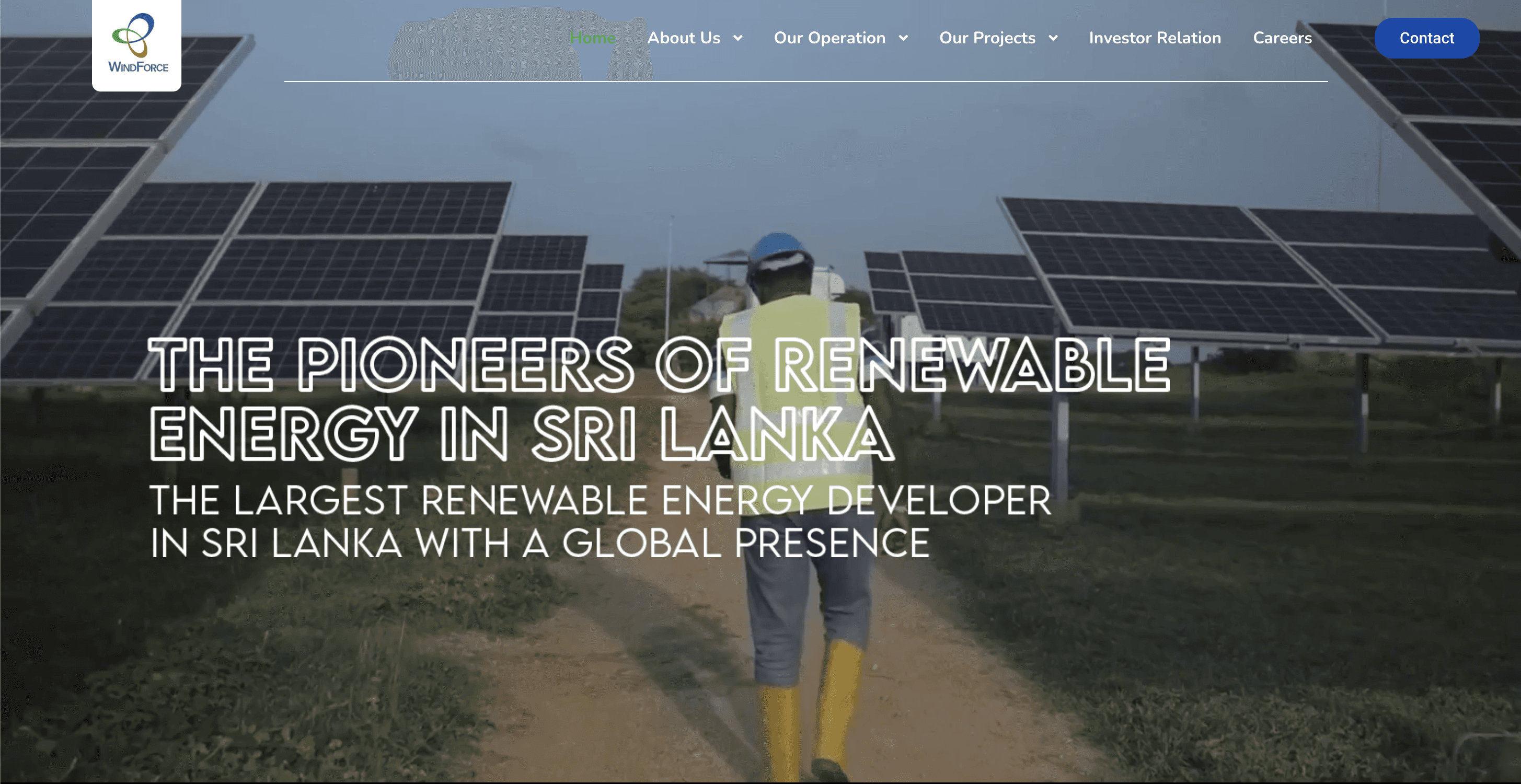
Despite being a technical leader with 255.1 MW capacity across 31+ projects, the existing website failed to represent this status. The business goal was to Increase conversion of B2B/B2G clients and generate qualified business leads.
The core digital problems leading to low engagement were:
Poor Trust Signals: Outdated visual design failed to convey international standards.
Difficult Information Architecture (IA): Complex services were confusingly organized, resulting in high bounce rates.
This friction required a redesign aimed at achieving a 50% increase in engagement and a 20% rise in qualified business leads.
A scalable user research framework, including Stakeholder Interviews and Heuristic Evaluation, was used to validate the business problem and establish clear design imperatives.
Lack of Transparency & Trust
Trust is Non-Negotiable: Policies, certifications, and operational metrics (255 MW capacity) were buried. The IA must be flattened to prioritize evidence.
Incoherent Information Architecture (IA)
Align IA with User Needs: The previous structure was corporate-centric. The IA needed restructuring to prioritize sustainability goals (SDGs) and global footprint.
Outdated Visual Hierarchy
Modern Design = Professional Trust: Low-quality media and poor color psychology reduced perceived professionalism. A modern, visually-driven brand system was required.
Missing Conversion Focus
Simplify the Path to Lead: Key pages needed clear, context-specific Calls-to-Action (CTAs) to guide B2B/B2G users to high-value interactions.
Analysis revealed a market trade-off: competitors either excelled at visual appeal or transparency/metrics, but rarely both. The opportunity for WindForce was to be the trusted leader that balances Transparency, Aesthetics, and Low Cognitive Load. The lack of interactive maps was also identified as a key feature gap.
The International Investor (B2B)
Seeking financial stability and rapid assessment of the company's track record and project pipeline.
Immediate access to performance metrics and a visual showcase of global projects (interactive map).
The Government Official (B2G)
Official (B2G)Requiring strict policy compliance, technical detail on the EPC process, and commitment to sustainability goals.
Clear, easily located policy documentation and a simplified breakdown of complex services.
The strategy centered on three interconnected pillars to drive lead generation and engagement:
Prominent Metric Display: Wireframes prioritized project data (100+ Projects, 20+ Investors) directly below the fold to instantly establish credibility.
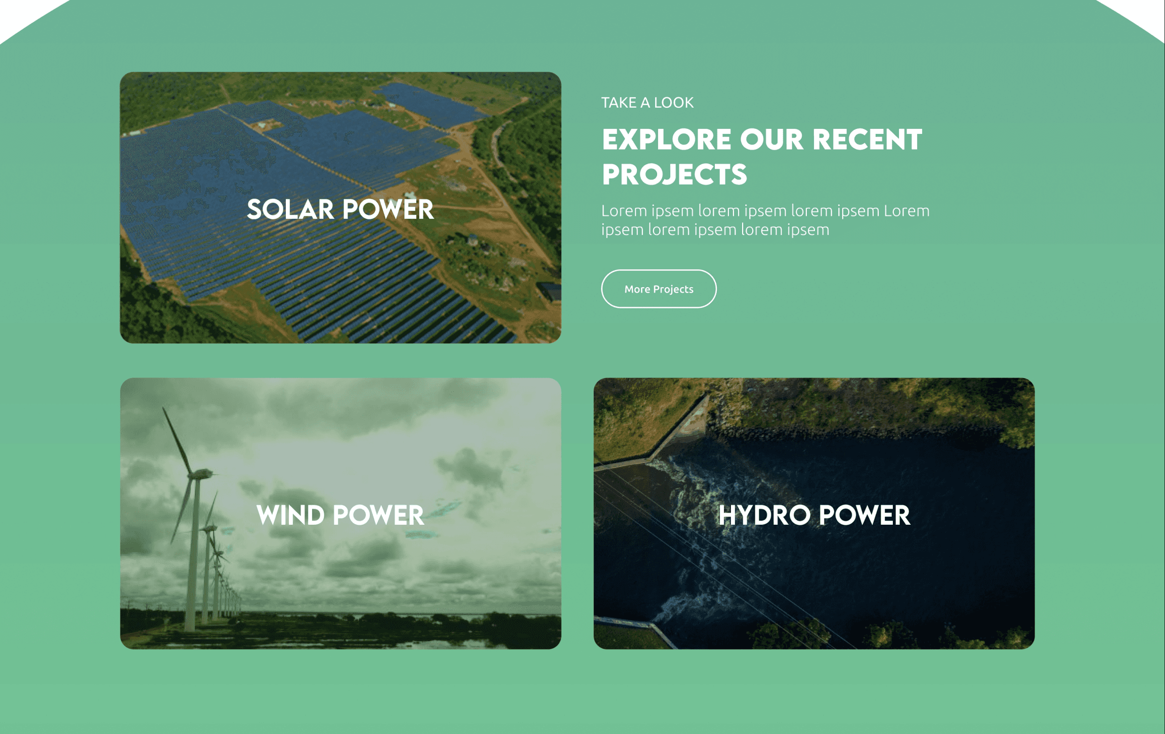
Global Reach Visualization: A dedicated "Locations" section featuring an interactive map was integrated on the homepage to visually demonstrate global scale and attract international investors.
Simplified Operations: The complex EPC process was broken down into a simplified, scannable visual journey ("What We Do") to minimize cognitive load.
The redesign was validated via A/B testing and event-based analytics to prove the ROI of the UX initiative.
User Engagement
50% Increase in Session Time and Pages per Visit.
Confirmed that the Strategic Data Visualization (interactive map) and simplified IA successfully reduced friction and kept users on the site longer.
Qualified Business Leads
20% Rise in Qualified Business Leads.
Achieved by tracking the increased count of specific conversion events proving the Conversion Path Simplification strategy was successful.
Trust & Credibility
Improved User Retention (Session time > 10 seconds).
The Transparency-First IA and modern visual design immediately established trust, encouraging deeper interaction with the site’s professional content.
This project confirmed the principle that in complex B2B/B2G domains, Transparency is the ultimate UX feature. The success of the redesign was directly correlated with our ability to use data-heavy UX research to challenge the existing corporate structure and strategically surface credibility signals (metrics, policies, projects) via a modern, low-cognitive-load UI.
Future iteration would focus on implementing personalized content recommendations for returning users to further optimize the lead conversion funnel.